Gallery
In the Business Value Modelling session at the XP users group 6 teams created a Business Value Model for a mobile phone company struggling to keep customers and regulators happy while reducing call center costs. In the final step, each team had to create a poster that they could use to guide their decisions and to explain the reason behind the project.
As you can see from the session feedback everybody wanted to know if they had built the ‘right’ model. Let’s take a stroll through the business value model gallery and see how the teams did. Click on the images to enlarge.
Team 1
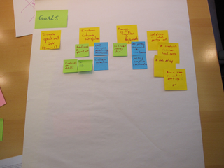
This team spent a lot of time discussing and didn’t have much time actually making the diagram. The large yellow Post-its contain the major goals. Small green Post-its are measures of the goal. Are small blue Post-its leading indicators? It’s not very clear. Only two goals seem to be worked out. There are four more large yellow Post-its to the side. What’s their meaning?
To make it perfect:
- Add a legend to the diagram
- Fully work out at least one goal
- A Business Value Model doesn’t have to be “perfect”. Make something quickly and iterate.
Team 2
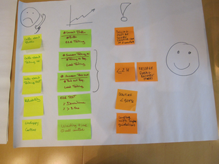
This team tells a story: we have unhappy customers and we have lots of measures that make that visible (left). We have several measures (both lagging at the top and leading at the bottom) that we can use to measure and drive improvement. Then we have several things on the right that we must comply with, either constraints or non-negotiable goals. All of this should lead to happy people (customers, employees, regulators).
To make it perfect:
- The diagram focuses heavily on the customer. Where are the company, the regulators and the project sponsor? How could you represent their views?
- Does the ordering of complaints have any meaning? If you could do only one thing, where would you focus?
Team 3
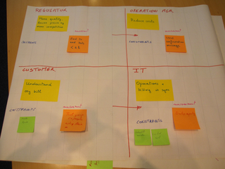
This is a very clear and near diagram with a business-like 4 quadrant format. Each of the quadrants represents the view of one stakeholder. I like the big, clear goals on the yellow Post-its. Each stakeholder has both constraints and measurements/tests.
To make it perfect:
- Explain the meaning of the arrows. Am I correct in interpreting it as customers and regulators have goals which drive internal goals of the Operations Manager and IT?
- The IT measurement “daily reporting” isn’t very actionable. What’s in the report?
- The Operations manager measurement “Send confirmation” message sounds more like an action or capability than an measure or test. How can you test that confirmations have been sent? Why will that reduce costs?
Team 4
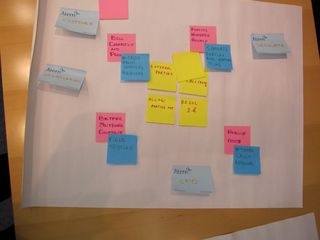
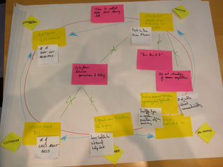
This team used a concentric circles model: on the outer circle we have the viewpoints of the stakeholders. The pink Post-Its represent a stakeholder goal; the attached blue Post-its are the measures for the goal. I’m not clear what the yellow Post-Its in the center mean. This team added a new goal that wasn’t in the original assignment: “Increase Antenna Coverage”. Apparently lots of people call in to say they can’t call 🙂
To make it perfect:
- Show some relationships between the different items so that it clear what belongs where. For example who wants to “Bill correctly”? The customer or the organisation? Who wants to port numbers quickly? The customer or the regulator?
- Explain the meaning of the yellow Post-its in the center
- Instead of the “Atern” Post-its (some leftovers from the Agile Business Conference), draw the stakeholders
Team 5
Another diagram that uses the concentric circles (or maybe a Mandala) idea. At the outside (the small yellow Post-Its) we see the stakeholders. Big bold yellow Post-its show the goals with attached measures. The Blue arrows indicate that achieving some goals helps achieve other goals. Big red Post-its indicate constraints.
To make it perfect:
- Make the stakeholders stand out more by drawing them or having larger Post-Its. Everything we do starts with the stakeholder.
- Add a small legend: for example what are the green lines?
- You don’t have to reuse the Post-its. Why not just redraw the goals and measures neatly?
Team 6
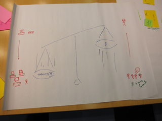
The last team had a completely drawn business value model. The central metaphor of the scales can be very powerful: by working on one side we can influence the other. Here: by increasing usability of the service, we reduce the cost of the service (or “Quality is free“). On the right, we want to reduce the number of people who call in (presumably without reducing the number of customers?). This is done, on the left, by going from a situation with few computers and lots of employees to one where computers have taken over the work. Or, as the team put it succinctly: “the solution is to replace people by computers”.
To make it perfect:
- we have one measure for cost (“# of incoming calls” on the right). How would you measure usability on the left?
- The image on the left (“replace employees by computers”) focuses on the ‘solution’. Can you represent how stakeholders will benefit?
- Replacing employees by computers is (for most people) not a very rousing goal. Is this the first message you want to get across when you explain your project? How do you think those employees feel? You’ll probably have to talk to them to implement the project.
At the end of the tour
What have we learned? A Business Value Model serves several purposes:
- To make it clear why we do the project: which stakeholder goals do we want to achieve?
- To prioritise: which goals are more important than others?
- To have project/product acceptance criteria: how will we know we achieved the goals?
- To show how we will steer the project: what measures/subgoals can we use to go in the right direction?
- To understand what is out of our control: which constraints should we abide by?
- To create a shared model of the important aspects of value and how these aspects affect each other: what is our hypothesis of how we will generate value?
What I look for in a model is:
- It’s clear: legible writing, a legend, appropriate use of colour and size
- It tells a story: “we focus first on <this> and then on <that>”, “if we do <this> it’ll lead to <that>”
- It’s motivating: the goals indicate that we’re making life and work better for people, there’s more than making money
- It’s useful: it helps me ask the right questions like “how is this feature going to help us achieve our goals?”; helps me to make the right decisions like “we’ll focus on area A first, because that will help us achieve our primary goal”
- It’s temporary: this is the best model of our system for now; as soon as we learn, we’ll update our model
- It’s shared: the whole team contributes to making and changing the model.
When is the model “done”? Ask yourself:
- Do I want to have this displayed prominently in the team room?
- Do I want to use this as a decision aid?
- Do I want to use this to explain the project to my most important customer or user; to the CFO; to the CEO; to a new team member?
- Do I know how we can test and invalidate the model?
- Do I want to keep this up to date?
See you at the Business Value Modelling session at XP Days Benelux. I’m looking forward to seeing the models that come out of that session.
