The project burn up/down chart
Our team has a very public burn up/down chart. This is where we stand today.
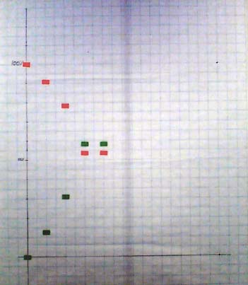 A short reminder:
- The red line tracks the burndown of estimated story work to do
- The green line tracks the delivery of estimated story value
What happened in the past two weeks?
Two weeks ago, both graphs went sharply up/down. The value chart a bit steeper than the cost chart, because we work on the highest value stories in the beginning of the project
Last week the chart was flat. No story completed this week. Oooops….
Why?
- One story counted two weeks ago turned out to be incomplete. Added some more tests to make the problem apparent, completed the implementation. No extra points, as they were already counted. If we hadn’t completed the story before the end of the week, we would have subtracted the effort and value.
- We’re all working on big, 4-5 point stories. When these complete we’ll have another big jump on the chart. That’s another disadvantage of big stories, they don’t help us level the load and they make tracking less smooth. Maybe we’re in trouble, but we won’t see quickly. We’ll only know next week, when these stories are expected to finish.
- Some of our users seem to be unclear on what new features are available and how to use them, so we spent some time explaining how the application works.
Lessons learned:
- Spend more time on tests, especially acceptance tests
- How could we have broken down these stories in 2-3 point parts?
- User acceptance of new features could become a bottleneck. Read more….
Big VISIBLE chart
People passing by and looking at the chart came up to me and asked “Hey, what’s wrong? Your graph is flat.“. Now that is instant visibility into the state of the project. Passers-by know at a glance when we’re doing well or badly.
Not bad for a tool that cost almost nothing and takes 10 minutes a week to update…