Flow? Traffic jams.
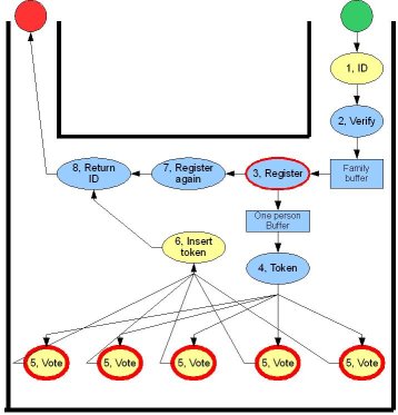
As we saw in the first part of this story, we tried to create flow to keep the constraint resource (the voting booths) utilized at maximum capacity. The process diagram looks quite clean and clear. But look at how it looks when we lay out the process steps on the physical layout of the room:

See how the paths of people entering and leaving the booths criss-cross? Because the reader in the box where voters insert their token (step 6 ) is quite slow (and because this reader has a usability problem we’ll see later), people start to queue before the token reader. Not so much flowing as a traffic jam.
Because people come back to the token reader after leaving the booth, they also go back in the direction of the entrance. Our natural instinct is to leave a ‘room’ the same way we entered it. The result is that some people forget to take back their ID (step 8 ) and most people try to leave via the entrance, trying to force their way through the queue that’s forming there.
The designers of these polling rooms should read pattern 131 “The flow through rooms” from Christopher Alexander’s A Pattern Language: “The movement between rooms is as important as the rooms themselves; and its arrangement has as much effect on social interaction in the rooms, as the interiors of the rooms”. Move that token reader and the returning of the ID to the extreme left and near the exit. The paths of people entering and leaving polling booths will intersect less. After inserting the token, people will more likely move to step 8, because it is nearer than any other potential activity. Because the exit is now in sight (and the entrance isn’t), they will naturally exit the room via the exit.
The usability (or lack thereof) of cards
The voting computers record votes on creditcard-like cards with a magnetic stripe. To operate the voting computers, voters insert the cards horizontally in the computers, magnetic strip at the bottom, much as they would do at an ATM. I don’t think anybody had any problem with that.
After voting, the cards are inserted in a sealed box with a card reader. The reader verifies the validity of the card and increments a counter. The reader is placed horizontally, not vertically like an ATM mounted in a wall.
How would you insert the card?
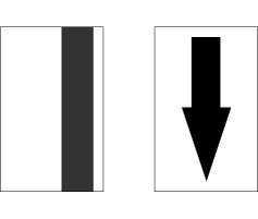
Below is a picture of both sides of the card. How would you insert the card in the reader? Like the card on the left or the card on the right? There are two more permutations, but these two are the most used ones. Take a moment to decide. Don’t look at the solution below 🙂

No peeking!
The correct answer is… the card on the left. The option chosen by the large majority of users is the card on the right, despite the fact that there is a drawing on box depicting the image on the left. Horizontal card readers like this one are used frequently at payment terminals, but in that case you have to insert the card with the image facing yourself, just like the card on the right. Card users know these conventions:
- In a vertical (ATM style) reader: magnetic strip below, image above
- In a horizontal (payment terminal) reader: magnetic strip rear, image front
This card reader defies convention (just after the voting computer has conformed to the convention) and users are confused.
Stop and go at the slow reader
The card reader is quite slow. If you try insert the second card too quickly after the previous card, the card is stuck. The first instinct of the voters is to push harder. This doesn’t work. The only thing that works is to take the card back and wait until the reader is ready. How do you know the reader is ready? After a while, we knew that the reader emitted a faint “whirr-click” when it had processed one card and was ready for another card. The best solution would be to have a faster reader. If that’s not possible, give the user some indication when the reader is ready, for example with a small red and green light. Neither of these options were available to us, so we had to spend some time to regulate access to this mini-bottleneck.
Keep it flowing
Most of the work throughout the day is about the same in size: verify and register one or a group of two or three people and let them vote. Sometimes, the work is larger and takes longer. For example, when someone acts like a proxy, their documents have to be verified and filed before they are allowed to vote. In these cases, the person is immediately taken out of the line at step 2 and put into a waiting buffer while verifications are performed. Meanwhile, the other (standard) voters get processed as usual. As soon as the verification is performed, the voter is returned to the head of the queue and their (now standard) request is treated. Except for step 2, everybody only deals with small, standard tasks.
Being interruptable, so you don’t have to be
Of course, someone has to verify those proxy documents. Someone has to answer questions or help people who have problems. All of those interrupt-driven tasks are performed by the team leader. They don’t perform any of the tasks in the process, they are available to be interrupted. If a new interrupt arrives when the team leader is already servicing an interrupt, an idle team member handles the interrupt or the interrupt is queued for the team leader.
An interruptable teammember with plenty of slack. Every team should have (at least) one!
Are we having fun yet?
Are you the kind of person that thinks this is a fun way to spend a Sunday morning? Are you the kind of person who thinks “Hmmm… How could I make this go faster? How could I avoid these errors? How could I make this more fun?” at work, in the checkout queue in the supermarket or when you’re mowing the lawn? If you are or would like to be like that, join Rob Westgeest and me at the “I’m not a bottleneck! I’m a free man!” simulation at the Agile Business Conference on 2 and 3 October 2007 in London. Or join us at the XP Days Benelux 2007 or any other fine agile event in your neighbourhood.
Out our office the right card was displayed on the box…