Presentation Zen
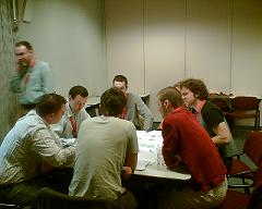
First session in the afternoon, we did the “Presentation Zen” session. We looked at a few examples of modern presentation styles, starting from Garr Reynolds‘ Presentation Zen site. We formed 4 groups and asked each team to give a presentation about what they liked and disliked. The teams presented their findings, first in a rehearsal, then to the people who weren’t in the session. It was a fun session (an important part of “presentation zen”), with a lot of creativity. Let’s hope we can reduce the number of bullet points in the world. Stop reciting bullet points today; start telling stories; start answering people’s questions.
Presenting the zen way
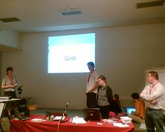
Vera, Willem, Kristel and Lieven explaining that you have to structure your presentation with the audience and your goal in mind.
They started out with a distracting, dense bulleted page. Then they presented the same information in several slides, using humor, asking questions of the audience and keeping us awake with their quattro presentation technique.
They stressed the fact that slides and documentation (handouts) should be different.
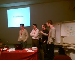 Bernard, Stijn, Hans and Paul presented themselves and what they liked and disliked in the different presentation styles.
They didn’t like the frenetic pace and many slides of a Dick Hardt or Lessig presentation. They feel it’s too intense and too easy to lose the focus of what the presenter is trying to tell.
They did like funny presentations, creativity and keeping the attention of the audience by the use of repetition, something you’ll encounter a lot in “Lessig” style presentations.
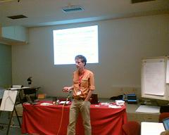 Johan presented the idea that the slides should underline, strengthen or summarize what the presenter is saying. It’s not the slides that tell the story, it’s the presenter.
I liked the fact that this team didn’t explain the different techniques, they showed them. “Show, don’t tell” at work…
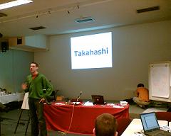 Klaas used a “Takahashi” style (a single word per slide, in big bold letters) throughout his presentation. He explained what the different styles were about.
This is very much a presentation style where all the attention is focused on the presenter and the story they’re telling. The slides are sparse and stark. Klaas did need more words and more time than the previous team to explain what the different styles were about. Sometimes, an image does say more than a thousand words.
What’s it all about?
What is that “Presentation Zen” thing all about and why host such a session at Agile Open? It’s not about powerpoint gimmicks and who has the most slides in his deck. It’s not about getting rid of bullet points. That’s just a symptom, not the root cause.
It’s about communicating our ideas effectively; getting the story across. It’s about storytelling and fun; engaging the audience. If you want to talk to people about agility (or any other subject that you feel strongly about), you first have to make sure that they don’t fall asleep, that they listen.
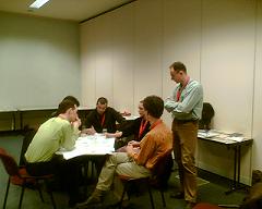 The second team, on the right analyzed the root causes of a situation where the balance between work and life wasn’t right. This was due, amongst other things, to long travel times between home and workplace. We had a similar situation during the session at