 Visual Controls are in
One of the great ideas Agile has incorporated from Lean is the use of Visual Control.
- Release burndown charts tell me if we’re going to deliver on our promises. If we’re significantly behind the plan, we can take action: update the plan or take action to come back to plan. If we’re significantly ahead of plan we can update the plan, by adding more value to the release or by releasing earlier.
- Kanban boards tell me what’s happening with each of the stories in the iteration. If there are too many stories in any column that might be a sign of a bottleneck ahead or we might be starting too many stories. If there aren’t enough stories in a column that might indicate a bottleneck in front or we might not be focusing on the right type of work.
- Different type of items tell me at a glance what’s happening. If there are many red issue/impediment/bug cards on the board, they’ll stand out like a sore thumb. We can “stop the line” and investigate why there are so many blockers.
- Different card colours for different types of features or customers might tell us if our feature mix is good. In one case, a lot of different colours might indicate that we’re not focused. In another case, too many cards of the same colour might mean we’re not giving enough attention to other types of customers.
It’s always fun to walk into a team space, look at the visualisations and ask questions. The most important question is “WHY?” Why do you update this graph? Why do you track these cards? Why is that column there? Why do you put red Post-it’s in that box? Why is there a green dot on this card? “Because the coach or the book told us to do it” is not an acceptable answer.
Why do you visualise these things?
The goal is to take action

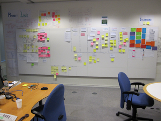
This picture shows about half of the information that this team visualises. This team knows what each of the columns means and what it means to move a story or task to another column. They know what to do when one of the columns gets too full. They know what to do when columns are empty. They know that red Post-its are dealt with differently than yellow Post-its. They know who should deal with impediments and questions (the red Post-its on the left) in each of the three impediment boxes (technical issues, business/feature issues, project issues).
They know that a story or task needs to be peer-reviewed before it can move in the “To Validate” column. If the review isn’t satisfactory, the card moves back to the “To Do” column. They know that the stakeholders in the context diagram need to be notified and consulted when something happens to the processes they participate in.
- A visualisation provides the up-to-date information to trigger actions
- These actions are defined upfront
- The whole team knows and agrees with the actions
A visualisation without actions is just a pretty picture.
Stop visualising if you can’t or won’t take action
I walked into a team room and saw that there were five burndown charts, one for each project the team was working on. One of the burndowns indicated that, if things continued to go as they had, this project was going to be released as planned. The four other burndowns indicated that these projects wouldn’t deliver as planned: the rate of descent was too low or they had levelled off (or ‘flatlined’): no progress was being made. I asked the team what they were going to do about those four projects.
Team: What do you mean?
Coach: Well, are you going to inform the customers or account managers of those four projects to tell them their project won’t be delivered as planned? Are you going to negotiate a new release date? Are you going to re-negotiate the scope of these projects if they have a fixed deadline? Can you drop or put some of these projects on hold so that you can stop context-switching and focus on one or a few projects? Are you going to look at the reasons for not delivering as planned? Are you going to see why you accepted more work than you could deliver?
Team: No. We’ll just continue working on the one big, important project and we’ll see what happens with the four others.
Coach: Then I’d advise you to stop updating those burndown charts, you’re just wasting time. You could even stop estimating those projects, because they seem to be of the “it’ll be ready when it’s ready” type.
If you’re not going to do anything with the information provided by your visualisation you might as well stop updating those visualisations.You’re just wasting your time. You’re obscuring the information that is used to trigger action.
If you’ve created a visualisation to take action to solve a problem and to verify if the problem is solved, you might take the visualisation down once the problem is completely solved. For example, you need to visualise the state and performance of a bottleneck while you’re dealing with it. Once the performance of the bottleneck has improved so much that the constraint moves somewhere else, you can stop monitoring. You now need to find a way to visualise the new bottleneck.
You need to refactor your visualisations. That’s why I like low-fidelity and easy to change visualisations. I think Xavier’s kanban boards are beautiful, clear and neat, but I prefer to use a whiteboard as a kanban board, so that we can quickly erase and redraw columns, rows and boxes. And I prefer to put up (story) cards with magnets, rather than stick up task Post-its.
Visualise to show the need for action
A manager came up to me with a worried look on his face.
Manager: That chart over there, is that project XYZ release 6.3?
Coach: Yes, that’s the burndown chart for project XYZ release 6.3.
Manager: Why hasn’t there been any progress in the past three iterations? This way we’re never going to be able to release by the end of the year!
Coach: The team has been waiting for a decision from you. They can’t mark any story as DONE until the acceptance criteria are agreed upon. Your decision affects about three quarters of all stories in this release. The team has tried to raise this impediment with you several times. See that red card on the board there? The lack of that decision is now the #1 risk for the project.
Manager: Oh.
That same day the decision was taken.
Making the consequences of inaction visible can be a way to try and trigger some action, when everything else has been tried.
This is not information for the team, so it shouldn’t be in the team space. It should be where the people who need to take action, are. Some companies put their build status up on a monitor at the entrance where all employees and visitors see it. In this case, the burndown chart was in the corridor that led up to the executives’ offices. A coffee corner can also be a very effective information radiator.
This small internal IT team implemented small projects for about ten internal customers. The internal customers didn’t set overall priorities, they all thought their project had the highest priority. In some companies the customer who shouts loudest gets highest priority. In this company, the customer who shouted most recently got highest priority. As a result, the team trashed: frequent context-switches and priority changes made it impossible to get things done.
During one lunch break a team member bought some packs of multi-coloured index cards and magnets. The team wrote the customer requests on the cards and affixed them to the side of a big iron cupboard next to the coffee machine. Each customer got different coloured cards. The cards were ordered top to bottom in the order in which they had been received.
As the customers got their coffee, they asked about the colourful display. The team explained that this was all the work they had to do, displayed in the order in which they would do it.
Customer: Wow, that’s a lot of work! So, where are my projects?
Team: There, do you see that green card? And there, near the bottom, is another one.
Customer: But that project is very urgent!
Team: Then you’ll have to talk to the customers of the projects above yours.
For the first time, these customers saw why their “simple projects” took several months to deliver: they weren’t the only customer of the team. For the first time they realised that they would have to talk to the other customers to set priorities, because “if you let those programmers set priorities there was no knowing when your project would be ready”.
It’s not a very effective way of triggering actions: you’re essentially “sending signals” in the hope that someone will pick them up. But sometimes it’s your last hope. You can only try this fo a short while: teams won’t keep updating the visualisation if there’s no reaction.
What can I do?
Have a look at all the visualisations your team uses.
If your team has none, ask yourself:
- What is the one piece of information I would absolutely need to see to do my job well? Of what upcoming problem(s) do I need to be aware?
- How could you visualise this information by spending no more than five minutes per day and using nothing more complicated than paper, pens, Post-its, magnets, pieces of string and a whiteboard?
- What different actions can you take based on that visualisation? How do you know things are going well? What kinds of problems can you see? What action will you take for each kind of problem?
If your team has visualisations, ask yourself:
- What is the one visualisation I wouldn’t want to miss? Why?
- For each of the elements (each row, column, box, card colour, writing on the card, number of cards in a box/row/column…): what action do I intend to take based on it?
- Is there any way to simplify this? If there are elements that don’t lead to an action, could I take them away?
Now have this same conversation with your team and refactor your visualisations.
The laws of Visual Management
Just make sure that you obey the two laws of Visual Management:
Before you can take action you must make the problems and goals visible.
If you make something visible you must be prepared to take action based upon the information shown.
Where do you start?
I don’t know about your situation, but I’d start by defining the goal of your team and finding the bottleneck.